

I’ve been in post as Digital Data Analyst for 12 weeks now. In that time, over half a million people visited and 1.6 million pages have been viewed on the UNISON website. We’ve had over 33,000 people join UNISON online.
Our social media posts have reached over 3 million timelines. We’ve received thousands of responses to online surveys, and we’ve processed and updated thousands of profiles amongst the 1.3million+ membership information records. UNISON is big.
Being a digital analyst at UNISON means creating, validating and reporting on this staggering level of activity in a way which is timely, understandable, and helps produce a stronger UNISON.
The world of digital data reporting is growing exponentially. As UNISON ventures further into the online world in ever more sophisticated ways as described in our Digital Work Plan, we must be able to determine successes and learn from failures in order to thrive.
There’s a word inside learning – earn. Learnings are earned in the online world, and you have to work hard for them, but they are important to gather as we increasingly transform into a digital-first organisation. As master brain / (ex) Unison digital leader Nick Scott (and W E Demming) put it;
“Learning is not compulsory. Neither is survival.”
So what’s it like being a digital analyst at UNISON? It’s interesting. Rather than throwing more big stats around, let’s look at two projects I’ve undertaken since taking up post
Online Form Abandonments
As I mentioned, we’ve had over 33,000 successful signups to Join.Unison.org.uk since the start of 2017.
It may come as no surprise that not everyone who attempted to join us via our online forms managed to do so!
Over 65,000 people passed through page one of the joining form since 1 January – so what happened to nearly half these people? They abandoned the joining process, but where and why are hard answers without some tricks employed to work it out.
To investigate, we began a project to identify sticking points within our signup forms.
We used 2 Google products; Google Analytics and Google Tag Manager, and one modified program from progressive Google genius Simo Ahava to identify specific form fields which ended up being the last field the user clicked on. We collected data for 6 weeks and then I summarised our findings.
The distribution of form abandonments (defined as people clicking on a form field, but not clicking the form submit button) showed us at what stage users were leaving the process:
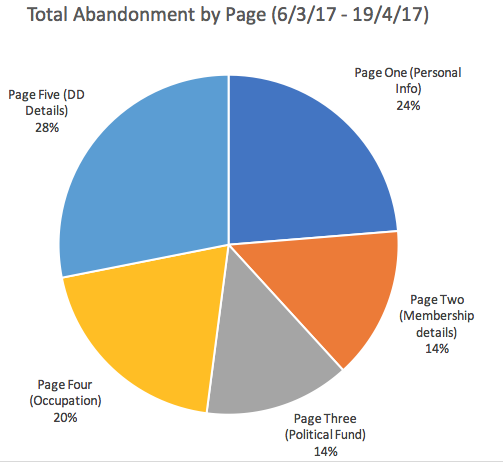
Whilst we could have worked this out through sleuthing in Google Analytics, what we could not do is determine which fields were responsible for users abandoning.
The project delivered insight through detailing which fields were last to be clicked on. A key finding was that the second most common field was the CAPTCHA field on page 1 – below is an example of what it looks like:
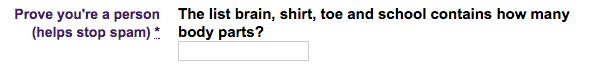 The CAPTCHA field on page 1 was the source of over 80% of abandonments on our join form, generating 40 times more abandonments than any other field on page 1.
CAPTCHA is a method to prevent unwanted form entries from automated online programs (web bots) that hunt the web for forms they can fill in for a variety of purposes (none of them good).
Asking a tricky human question is good at weeding out software which can’t think like us, but the nature of the questions posed can be confusing and are not always easy to answer – especially for a user short of time or concentration.
Fortunately, the technology behind such security measures has moved on significantly to avoid asking questions which the user fails to answer, relying on less intrusive aspects such as mouse movement assessment and not just correct answers.
UNISON is shortly to begin a new Join form design project, so this insight along with the rest of the report will feed in to help guide decisions on the sorts technology, of the questions we ask and how we ask them, all aimed at improving the amount of people who successfully join us on the first try. If you’d like to have a read of the report, just ask.
Digital Dashboarding
UNISON has tools to collect and store a huge range of statistics about our digital activity and our users activity online, every second of every day.
We have a wide range of marketing tools and platforms; each store detailed information about our digital activities and their impact on our audiences.
Presenting only the most meaningful and most relevant information is therefore a priority, much in the same way as a car dashboard does for your journey; not everything needs to be read and understood to get where you need to!
Within the communications department, our digital dashboard development is well underway. Digital dashboards work by setting up connections to remote sources of information (like those held on Google, Facebook, Twitter, Youtube, Salesforce and so on) and pulling them all into one place to be graphed, charted and otherwise visualised in a digital dashboard which all interested staff can have access to.
Our aim is to begin providing feedback – much as the car dash does – on our online journey, so that we can better steer ourselves in the online space. Here’s a simple example for our Save Care Now campaign, part of our comms engagement dash:
By continuing to connect remote sources of information and present it in one place, we begin to realise an important goal:
Tailor-made digital reporting
Because our tools for collecting data allow for very detailed information to be captured, so must our dashboards be capable of displaying it. In time, we will grow in our ability to understand the context of user journeys, the narrative of who does what and why.
To help understand our content offerings on UNISON.org, we now have a report which breaks down the popularity of our top content by page views over 30 days.
This is a timely indication of the zeitgeist of people visiting UNISON.org, and helps us shape our editorial process. When this is coupled with another report showing what web content users decide to share over their own social networks, we take another step towards understanding our audience.
Ballot performance
Yet another creative use of dashboards to date was to assess the nature of responses for the recent Scottish Local Government Consultative Ballot. With a connection to Salesforce and our innovative use of online surveys to process voting information, we were able to collate ballot responses and present demographics in a digital dash – a first at UNISON.
We have laid out response levels according to activist status, membership length, age range, gender, the amount of updated membership details we gained, even participation rates by branch.
All of this is aimed at helping to identify opportunities and areas to improve when undertaking the vital actions our members decide upon in creating better workplaces and working conditions.
The future
As UNISON continues to forge ahead in the online world, we will need information fed back and integrated into our projects and campaigns.
As a digital data analyst, what this means is attempting to keep up with our pace and serve UNISON the highest quality information and insight about it.
It also means not having your head explode with the new technology and methods required to do it.
When you find out the API you thought was working OK actually won’t work at all with ur systems pic.twitter.com/Mb692cDIbT
— Richard Landry (@TheLandroid) May 18, 2017
If you’d like to find out more on the sort of stuff I’ve been up to, albeit in a slightly slangy, 140 character format, I invite you to follow me on twitter (@thelandroid)